
Graphs. Plots, figures, infographics. Whatever you want to call them, they’re everywhere. From the daily news to Twitter polls to academic papers, data visualization plays a major role in communicating information about the world, be it changes in the political landscape or new scientific findings. As such, good visual design can help convey a clear message, while bad design can easily end up misleading and distorting public opinion.
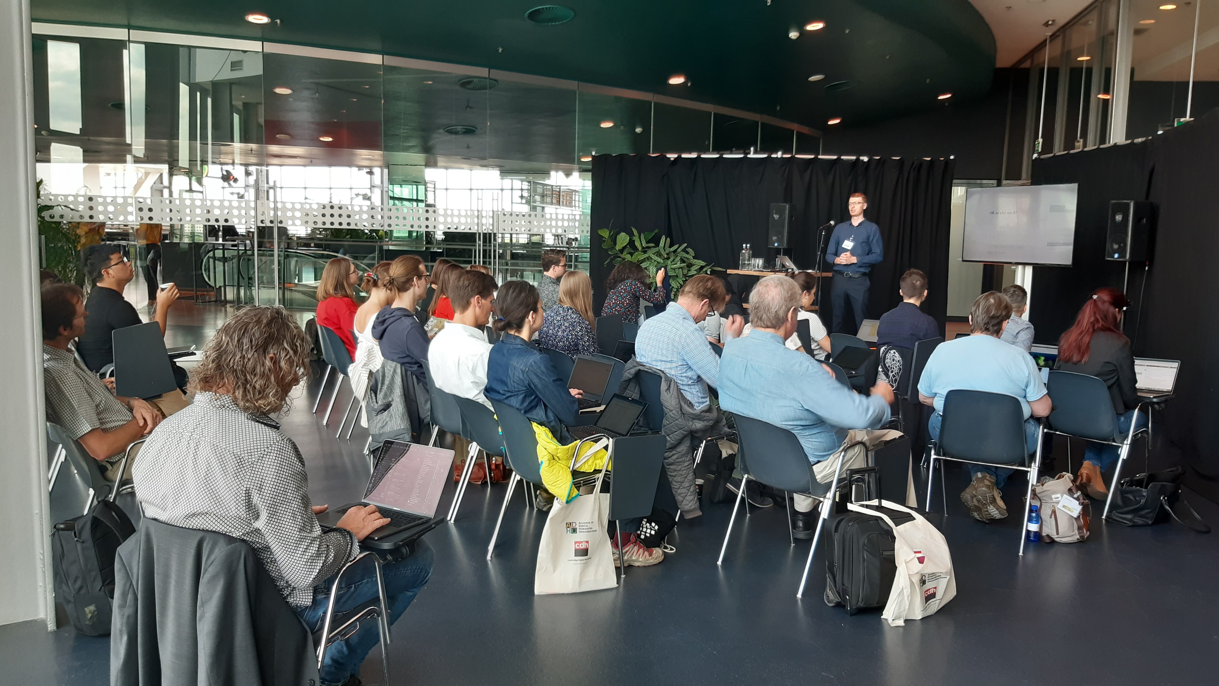
In addition to my PhD studies in linguistics, I’ve been delivering practical workshops across the UK, teaching primarily humanities and social science scholars the tools and methods for producing clear and efficient visualizations of their data, while following open science principles. The GoAbroad Fund helped me go international and organize such a workshop this summer in Utrect, the Netherlands, at the annual Digital Humanities 2019 conference.
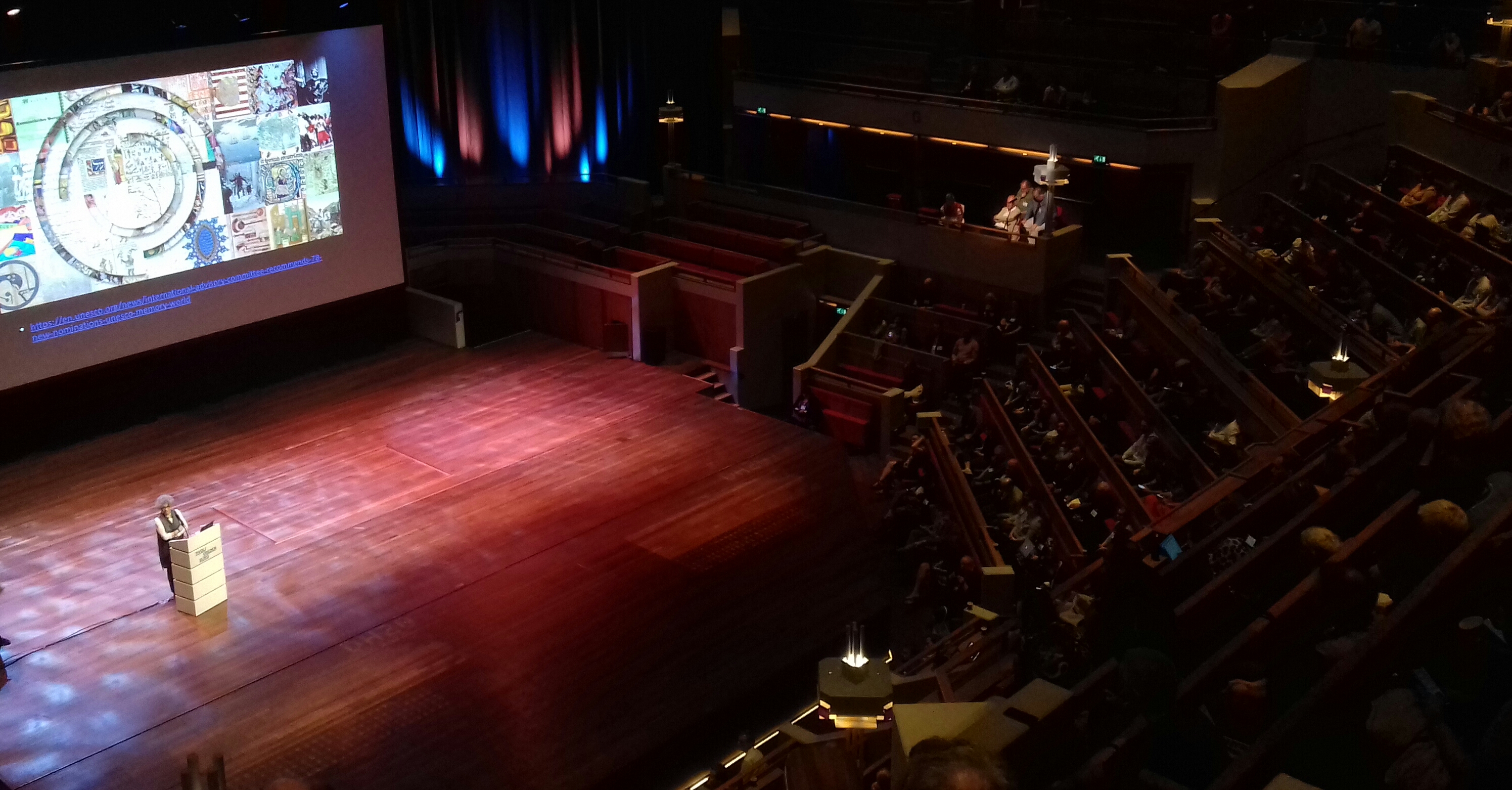
This is the field’s largest annual conference series, with over a thousand delegates attending the 123 talks, 100 posters, 29 panels and 15 workshops that made up the programme this year. Digital humanities is an emerging discipline advocating the use of computational tools and quantitative analysis in the humanities (linguistics, literature, history, etc.), which have traditionally relied on qualitative, small-scale methods. These new approaches are needed to better understand and learn from data accumulated in archives across the world, as well as the big data produced daily in our digital society. In DH courses, there’s often emphasis on practical skills like programming, applicable in research but also opening up opportunities for students in the wider job market. The community itself is keen on learning, hence the practical workshops at the conference.
My workshop focused on of teaching participants just enough of the basics of R – a free open-source programming language commonly used in data science – to get to building beautiful plots using code. The advantages of doing dataviz programmatically are many, including boundless freedom of expression and easy replicability of graphs (either by the original author to make more graphs, or by other scholars attempting to reproduce a study). We covered common graph types like scatterplots and time series, but also how to easily make geographical maps, visually summarize large text collections, and finally, how to produce interactive applets that users can zoom into and hover over to reveal more data. All my materials are open-source and available online along with software installation instructions: https://andreskarjus.github.io/artofthefigure.
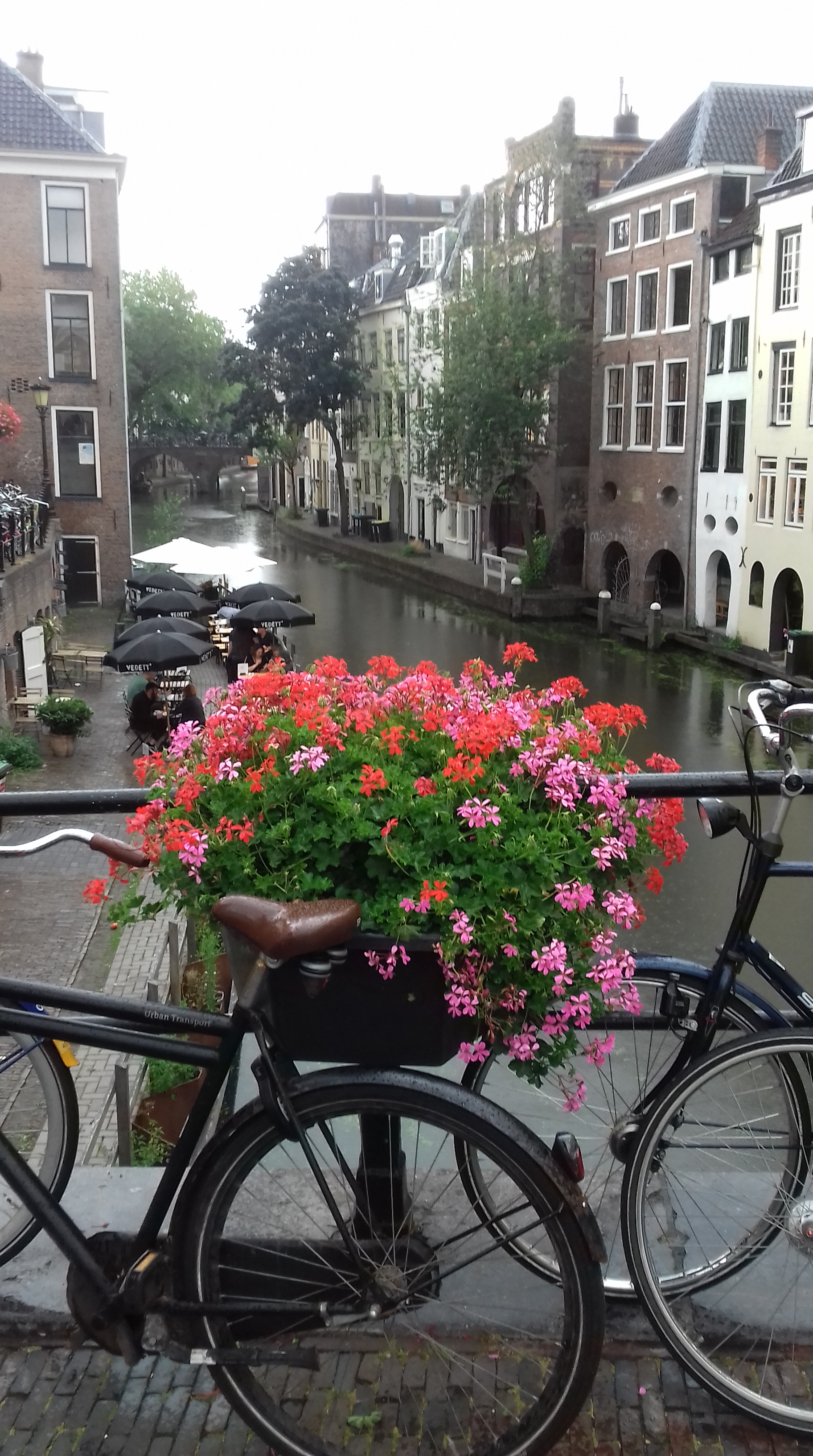
The workshops took place on the first day, so I spent the rest of the week going to interesting talks, networking with digital humanities scholars, and enjoying a bit of Utrecht, a wonderful city of canals, gothic towers, endless cycle paths and hidden beer gardens.
– Andres Karjus, PhD student at the Centre for Language Evolution, University of Edinburgh (https://andreskarjus.github.io, @andreskarjus, @artofdataviz)

Leave a comment